Learn why typography plays an important role in the overall design of websites and apps and why good typography will make your design pop - while bad typography will be the downfall of its usability.
There are various aspects of mobile design that need to be considered by designers when developing a new mobile application. As of recently, typography has become quite a significant tool in mobile app design. It is considered one of the major instruments that shape up the visual communication of a mobile application.
Certainly, communication plays a crucial role in the design of mobile applications and mobile apps need to communicate their purpose well. The main reason behind focusing on the aspect of typography is that, right off the bat, mobile app developers and designers strive to create a transparent relationship between the mobile application and the user. This is because providing the user with a highly interactive mobile app helps them achieve their specific goals.
However, finding or choosing the right sort of typography for a particular app or website is also necessary. It is needless to say that each and every designer works differently and has different opinions about the choice of typefaces as there are no particular set of rules that work in all the cases. Therefore, it becomes critical for mobile app development companies, designers, and business owners to infuse their mobile applications with highly intuitive typography.
Here are few reasons why typography is crucial for enhancing the app’s user experience.
Good typography supports visual hierarchy
Typographic hierarchy across different sections of a mobile application is important. Typographic hierarchy is a type of visual hierarchy in the aspect of designing. The lettering is designed in such a hierarchical manner that the most significant words are presented with the best effect to guide users.
If you do not maintain typographic hierarchy, then the entire content will fall flat. Its absence will distract the users and prevent them from determining the most relevant section of information as it develops contrasting differences between the parts. Designers vary sizes, colors, fonts, and typefaces to bring these differences into different layers.
One of the prime objectives of any design is to subliminally hold the users’ interest and keep their attention on the subject of the app. This is where typography plays a vital role, as typography supports a certain form of visual hierarchy that guides users for a responsive navigation.
With the help of good typography, we can make it incredibly easy for end users to follow the analogical flow of data and the arrangement of visuals in terms of size, style, alignment, font face, and colors.
Typography speaks to end users
With good use of typography, it is easy to enhance the graphics of a mobile application, but there is much more to it than that. Typography impacts the human psychology in a significant manner. Effective typography affects consumer behavior positively and enhances the responsiveness levels.
Visual language and typography, together, play a tremendous role in influencing people’s emotions. There is a vast range of typography types that achieve subtle alterations in volume and texture of voice. Graphic designers use typography to convey mood, age, personality, and gender. The role of typography is significant enough to change user perception with subtle diversities between typefaces.
Good looking typography with suitable fonts and sizes will lead to increasing and retaining user attention, as it helps in connecting with the user and enhances app efficiency.
Typography is sharply associated with the end user’s way of relating to a particular design. The primary focus of any app is engaging end users, and through the use of the written word we can do just that- interact with our users via good design.
One bad choice leads to another hassle
Many mobile applications are made with the purpose of being used by a large number of people to indulge in purchasing activities such as buying products and services online. They serve as a catalyst in the process of creating a brand identity. Therefore, one wrong choice in the course of selecting typography could lead to hassle and severe problems for the brand later on.
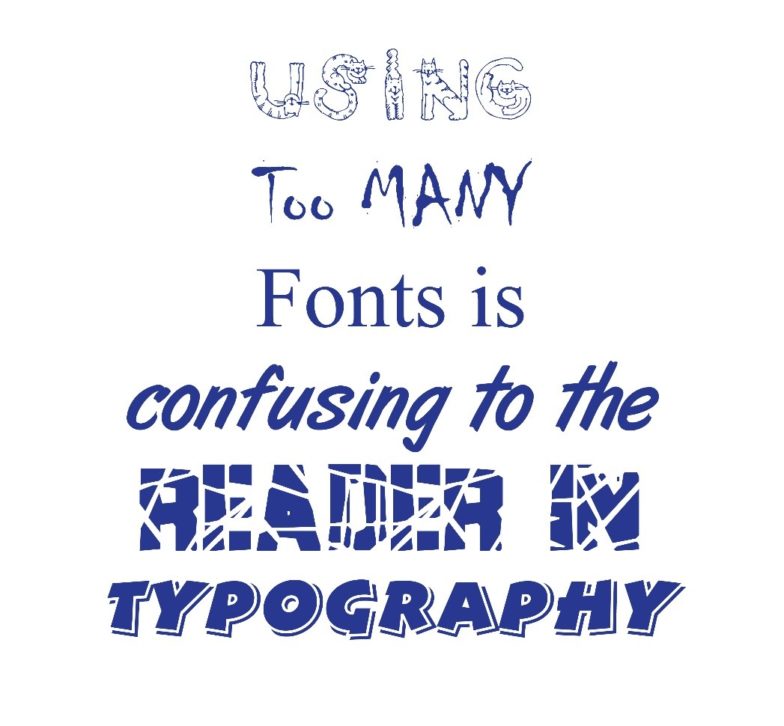
During the selection of typography for an app design, even a small mistake might lead to a domino-effect of sorts. This is why it is important to avoid making decisions you are unsure of. There are some common errors the designers tend to commit, such as misjudged text line lengths, wrongly paired typefaces, poor body font choices, bad color choices, and the wrongly chosen line height between two lines of text. All of these should be given utmost attention as they are prominent parts of helping users read fluently. If you are using well-designed typeface it’s designer has made type cells especially for each letter, and kerning pairs for every pair of letters in that family. Sometimes playing with kerning breaks text flow considerably and destroys legibility.
Don’t forget to pay attention to the space between the letters. This detail should be given utmost attention as it is a prominent part of helping your users read fluently. The spacing can be regulated by the letter-spacing CSS feature. Moreover, it is a valuable consideration always to commence with 140% of the font size to avoid leading issues. Having said this, ‘leading’ defines the vertical distance amongst the two uninterrupted lines of the text. When designers forget to pay attention to this it ultimately results in descenders of a line overlapping with the ascenders of a lower one. But again, putting too much of space in the middle of the rows will result in loose, tough to read text.
Improper spacing, instability, and rare alignments in the selection of font families, sizes, and colors can ruin the overall brand image.
A properly developed mobile application is the mix of usability, content, speed, convenience, design, and usefulness. End users view a mobile application as a unit. Typography, as well as all the other parts of design, should be as invisible as possible. Meaning, content is and should be king.
Good typography conveys a message with transparency
It is important for mobile designers to ensure that typography complements the app design and suits it so that customers’ loyalty can be achieved through presenting your app with credibility.
The look of the message you want to convey affects the reader’s way of reacting to it, and if it is subtly visually attractive, the reaction is usually on the positive side. However, if the message is not easily to read and grasp, it loses its value. So, it is important to choose a nicely paired set of type families and, to avoid tracking and leading issues, make sure there are no mistakes in the typeface such as incorrect ellipses and bad practices such as underlining text which is not hyperlinked.
The selection of typography is majorly dependent on the surrounding elements which shaped up the user interface. It enables them to showcase the relevant details with the use of good typography, which in turn, drives end users’ actions through as few words as neccassery. This will retain their interest in the mobile application and motivate them to keep coming back.
Good typographic choices will compliment your app design
The primary role of typography is not just to deliver the information to your user, but to also compliment the overall design of a mobile application or a website. This will not only improve the user experience of your app but also maintain the interest of end users in the app or website you are developing.

A great app design with bad looking typography does not enhance the success of business. In fact, it only means wasting a given chance to utilize space properly. This makes it important for designers to determine what type families and sizes would be most suitable for the app they are working on. When needed, a highly unique typography can be created just to accompany the overall app design.
There are plenty of type families to choose from, but the four basic type families that help you understand what is right for your project and what sizes are suitable are Serif, Sans Serif, Script, and Decorative.
Choosing the right fonts matters a lot as font choices can decide the tone for the entire design and affect viewers’ interest and their reactions. The four different aspects you should pay attention to when deciding on the right font for your project are its readability, size, versatility, and color. It is always advisable to find fonts that share a common trait and compliment each other.
In order to do that, it is best to pick fonts made by the same typeface designer. This is because every designer has their own unique aesthetic. Each and every font should be given a unique and different purpose in the overall design so that the design guides readers in each and every section.
As of late, we are witnessing more and more designers starting to pay closer attention to the high valaue of text and typography. This is because of today’s modern retina screens and browsers that can finally render typography properly. This new practice improves the holistic outlook of a mobile application and enhances its user experience to a big extent. Indeed, a mobile application with bad typography leads to dissatisfied UX.
About the author
Shahid Abbasi is a big time tech geek working with the best mobile app development company, Peerbits. He is an experienced UX designer, designing enhanced UI/UX for websites and mobile apps. He likes to share his knowledge in technical blogs. Over the weekends, he transforms himself into an awesome cook!