Wall of Tweets is a twitterwall product designed and developed by full service UX consultancy UX Passion here in Croatia.
Wall of Tweets is a Twitter wall product designed and developed by the full service UX agency UX Passion here in Croatia. It’s very popular and used throughout the world. In this article I’d like to share some of the design thinking, design research and decisions behind this product and how it compares to other solutions on the market.
Introduction
Wall of Tweets is our Twitter wall solution available in two main forms. The first one is a simple HTML / JavaScript widget that you can embed in your website and follow a specific Twitter hashtag, phrase, user or any combination of those. It contains a profanities filter and numerous other features. Simple and elegant to use, it’s the right choice for all of you looking to add a Twitter wall to your website. It requires no plugins – all you need is a modern web browser.
Our flagship product however is targeted to be used and displayed at conferences, events and similar venues. It’s usually run from a laptop and projected on a big canvas using a beamer (projector), although some of our customers like to use plasma / LCD screens. It provides a very rich informational context, attractive visuals and – what we are most proud of – it’s always unique. We work closely with you to provide you with a unique, customized experience that is tailored to your event, brand and expectations. That has proven to be a major success since our clients do appreciate that extra effort we put for them and their customers (conference attendees, associates etc.) are really pleased.

I won’t go into too many details regarding our Wall of Tweets solution, TechCrunch has some nice words about Wall of Tweets, and there’s an official Wall of Tweets website. You can also follow the Wall of Tweets on Twitter (@WallOfTweets).
What I want to talk about are some design decisions we’ve put in place and how they reflect on our users and our overall success.
Content is the king, but context is the kingdom
This is a phrase I heard not so long ago, but it has served as a guideline for our product and our product planning since day one. Twitter is cool but it can be a mess. Tweets can be lost in a sea of other tweets and the limitation of only 140 characters is a challenge of its own. Using hashtags can help with that in that it helps you filter the tweets you are interested in (given that their authors have used the right hashtag). However, even in those cases, there’s a challenge as to how to present those tweets using the Twitter wall solutions.
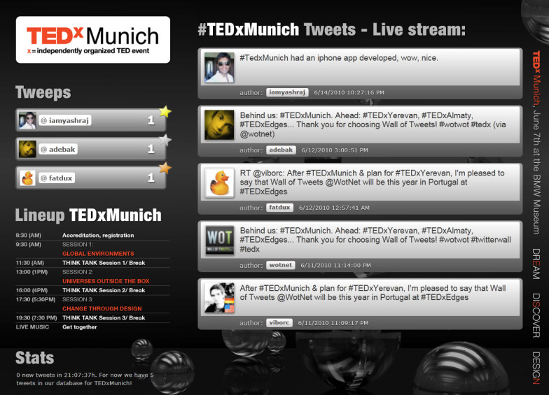
We’ve set several simple and clear design goals – we must provide users with the broader context, we must ensure that speakers and conference attendees are THE STARS of the conference, NOT our product. Animations and transitions are nice but they should be there for just one reason – to provide a clearer understanding and facilitate the context – not to serve as eye candy (we’ve seen a number of paid and freely available solutions on the market using animations as the primary feature of the Twitter wall. While they can be interesting to see and maybe, in some rare cases, even very attractive, they are terrible when it comes to drawing attention away from the content, the speaker and the conference itself.

Also, most of them show one tweet at a time – either statically or in some sort of fluid manner. Again, this might look interesting, but it’s killing the context. Showing a single tweet is a bad idea. Twitter, arguably as with other social networks, is all about conversation and communication; it’s about sharing the ideas and thoughts but – within a context. Our Wall of Tweets does exactly that – we don’t use cheesy animations and transitions, and we don’t show just a single tweet; instead, we provide you with several tweets in a list or some other layout. Now you can see the context of each tweet, get the idea of the overall conversation and be more involved.
The conversation is always there, but we excel at showing it to you, your customers and other users.
We are not the stars – the speakers are
When we are selling or giving away our Wall of Tweets solution (we are proud sponsor of TEDx conferences and UX/UI/AI/usability/design conferences – if interested just drop me an email at viborATuxassionDOTcom), we always provide our users with guidelines. Those guidelines are not obligatory but they are here to make sure that you will have the best possible experience.
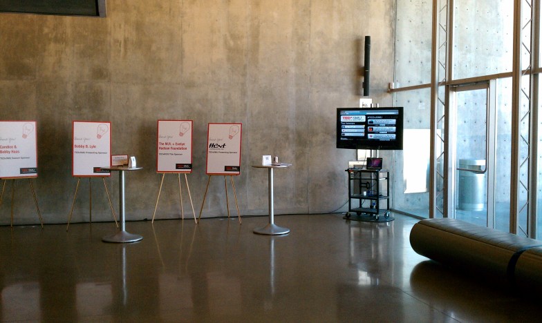
We suggest you use our Wall of Tweets in front of the conference room (like in a lobby or another networking space) and not really during the presentation itself. We do support cases where you want to use our Wall of Tweets in the conference room itself but we suggest you use it during the Q&A session. Even then, our Wall of Tweets is a non-intrusive, in-context solution that is situated in the background allowing the real stars to shine.
Some results
We conducted 12 interviews with conference organizers, speakers and conference attendees who have been exposed to our Wall of Tweets solution and other competing solutions where tweets are being shown out of context in a fluid manner – and we got some really interesting results.
In total 8 out of 12 users prefer a more static, in-context display of information. They describe this as: “easy to read and understand”, “gives me a better idea of what the communication is all about”, “it doesn’t distract me or the speaker”, “ I’ve seen an audience laughing and pointing at dynamic tweets and not really following the speaker”, “it feels calm and I don’t feel like I have to rush to read”…
On the other hand, 4 out of 12 describe dynamic, fluid layouts as “more attractive for shorter time periods”, “huge images and avatars are cool”, “I love shiny, flashy things and this works fine for me” and lastly – “I don’t care about the conferences so this is good for me to kill some time”.
When talking to conference organizers, 4 out of 5 said that they don’t care about the underlying technology as long as it supports their event and their goals. The reason we asked this questions was due to the fact that we are using Silverlight as a rich plug-in for our venue-based version of Wall of Tweets. Just one person said that he’d prefer a non-plugin based version but he didn’t provide any detailed explanation as to why.
However, our solution will work on your Mac or PC (even on Linux using Moonlight), and it doesn’t care which browser you use. Firefox? Sure. Chrome? You betcha! Internet Explorer – if you are using it – we are running on it! Safari? Of course. You get the point…
Research-driven design aka Conclusion
Wall of Tweets is a really interesting and popular product – but it was also a great subject for us to conduct a serious analysis of our target users’ expectations and then to conduct fairly detailed research to understand our users’ needs and feelings about our product.
We are proud to say that we do charge for our product. We provide you with a unique, customized experience and our Creative Director works with you on a day-by-day basis. You get what you pay for. And more. You need video or custom ads on your Wall of Tweets? Subtle, in-context animation? A profanities filter? A new module developed just for you? You can have it all. We are not giving you just a Twitter wall – we are giving you a Wall of Tweets experience that is based on our design research and process. And while we are talking about the process – that means we are still learning and building upon what we hear from our clients every day.
We’ve learned many things – and we’ve been humbled and surprised by some results. We’ve been betting on our premise that we want to give a more static, in-context, conversationalist layout of tweets and to deliberately dismiss fluid layouts. After research and user interviews, we were happy to learn that was a good idea.
Also, we’ve had our misses – our early versions featured a chart showing the number of tweets over the course of time and users pretty much ignored that piece of conten. So today it’s not a part of our standard implementation (though you can get it if you have a desire for that).
Also, a new innovation was a list of “Top Tweeps” – something that was pretty much put in place to facilitate more tweeting and generate a competitive spirit. It was a huge hit – and it was not really used for spamming.
We’ve been really happy to see that some of our competitors have started using that (and other ideas) as well. Well, now with our design process exposed and some insights behind some of our design decisions you guys can be even more productive. As long as the end users will benefit from that, we are all in.
Imitation is the sincerest form of flattery, or so they say, right?
Let’s keep in touch – You should follow me on Twitter now!