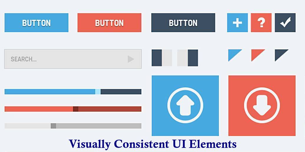
Visual Consistency is so important, building visually consistent pages has become an unspoken rule. This article brings you great tips to go with when attempting to bring balance and visual consistency into your UI.
In our first ever guest post, Ava Garcia who works as a designer at OSSMedia Ltd. is going to discuss the importance of Visual Consistency in UI design, and give you a few tips on how to easily achieve said consistency. If you’re curious to know more about Ava and her work, you will find her bio at the bottom of this page. Enjoy!
There is no disputing the fact that UI design is the most vital component of web development. Users appreciate interesting and useful websites and apps, and user interface design helps us to produce a UI which makes it easy and enjoyable for users to interact with good products.
A good user interface design aims to foretell the users what they need to do when approaching an interface. In simple words, a great user interface design is one that helps users accomplish any task in the most efficient way possible.
Without a doubt, the look and feel of a website’s design is important. However, how well the UI functions plays a crucial role in the success of a web page.
There are different factors that make a UI design successful, and the most important one is maintaining visual consistency in how the elements are placed in a web design’s UI. That’s because the lack of consistency in your user interface design can make your application or website design look chaotic and confusing to the viewer. On the other hand, maintaining visual consistency can help users to easily communicate with your system.

In this article, I will present you with a couple of techniques that will help you achieve visual consistency in designing UI.
Let’s have a quick look at a few benefits of having a visually consistent user interface design:
Benefits of Visual Consistency in User Interface Design
Increased Usability
A web design that’s more usable attracts more traffic towards it, and visual consistency is a great way to increase usability of your UI design. This is because it helps in arranging and publishing content in a structured manner.
Eliminates Flawless Communication
An excellent UI design is one that makes it easy for users to access the most important content quickly and with ease. To do so, it is important that your user interface design prioritizes the content that you would like to show your users in a particular manner. Achieving visual consistency between design elements on your web page can help you in highlighting the most important part of your website data in a clear and concise manner.
Evokes a Strong Emotional Response
An impeccably designed UI has the ability to evoke an emotional response. A user interface that conveys emotion can easily make a connection with your audience and hold them on your site for longer. Emotions can drive the decisions we make, and you can create an emotional impact via your user interface design by maintaining visual consistency.
Techniques of Creating Visually Consistent User Interface Design
Use Heat Maps to Understand User’s Behavior
Often when making web design decisions, most of the designers (if not all) rely on Google Analytics. However, using this kind of traditional method lets you know about the number of users who visited your web page and clicked on things within that page, but it doesn’t tell you why the users landed on your page.

Of course, getting to know about “why” instead of “how” can help you create a user interface design that ensures better usability. This is where the ‘Heat Maps’ come in handy. They help you know about the points in your website design that received maximum attention from your visitors. For instance, you can know if users are clicking on the checkout button or not by conducting a heat map study. Bing Ads, for example, performed an eye tracking study which resulted in a heat map and found that the more mobile extensions an ad contains, the more attention it gets.
Once you get to know about the pattern users follow to access information on your site, you can place elements in your UI design in a manner that ensures visual consistency.
Making the Proper Use of White Spaces
Whitespace is one of the most undervalued parameters in web design – seen by users as empty, or a waste of space. However, it is one of the most viable means to maintaining visual consistency between the elements of a UI design.
Whitespace is referred to as the spacing between the different elements of a website. Most importantly, whitespace help in making the content easier to read. Additionally, it helps scan the elements of a web page quickly. For example, let’s say you visit a store. Obviously, you won’t be able to move throughout that store comfortably if there isn’t enough space. Likewise, not adding proper whitespace into UI design makes the layout of the site incomprehensible for your site visitors.
In fact, according to an online study, it has been concluded that using whitespace strategically helps improve readability by almost 20%. In a nutshell, whitespace can play a crucial role in improving the overall user experience.
Nobody wants to navigate a web page that makes them put a lot of effort into viewing and interacting with things within that page. Good use of whitespace makes the website look less cluttered and helps make the content and other elements easier to read. As a great example, Dropbox makes excellent use of whitespace:

Using the Right Contrast for all Elements of UI Design
The third technique that can be used to create visual consistency in UI design is to make use of the right contrast for elements like shapes, sizes, colors, etc. For example, using a light color for the main navigation menu such as white, while using a bright color background like yellow makes the menu items visually inconsistent and difficult to read. The same is the case with font size and other design elements. Using the wrong contrast for elements results in making the visual hierarchy for your site unclear to the users.
And so, try to use the suitable contrast between design elements. Using a CSS helps in maintaining consistency between those elements. For example, the Red Hat website features several elements with a uniform contrast, presenting the content in a consistent manner throughout the website. As you can see in the below image of the Red Hat website, the primary and the secondary navigation using uniform contrasting colors is immediately identifiable.

Conclusion
Prioritizing how your UI elements are visually displayed is something that you shouldn’t ignore when building a website or application. Having visually consistent UI elements helps in making the design more creative without leading to any confusion.
About the author
Ava Garcia is a professional WordPress developer and has been working with OSSMedia Ltd – a WordPress Outsourcing and PSD to WordPress services company for the past 5 years. She loves to share information regarding web technology.